Monday, January 30, 2012

Concept Collages / Sweet Springs

If anyone ever reads my resume, portfolio, or even LinkedIn for that matter, they will see that I listed "collage" as a skill.  "And this is relevant... how?" is probably what you are thinking.  Allow me to explain.

One of my first "concept collages" came from an actual assignment in second year studio, where we had to put together photographs of the site in a way that conveyed the scene.  We had to do this for every project I believe.  It was a way to get our creative juices flowing.  It worked (for me).

Circa 2009.

The colors I ended up with in this collage/montage really stuck with me.  It perfectly showcases what a beautiful day in Blacksburg can look like, and captures the spirit of the School of Visual Arts.  This building is in the [kind of gross] part of downtown where there are some yummm restaurants (anybody want a gyro?).  It's called the armory and, as you could guess, use to be the actual armory building back when Virginia Tech was strictly a military academy.  It now houses the artistic minds of Virginia Tech's finest.

Sticking with this theme of montage and collage, I began most of my project with quick Photoshop renderings using material images and heavy use of the "distort" tool.  I swear ctrl+T is the best thing I ever learned to do in Photoshop.

This technique helps me easily envision a space in my head, along with sketching.  While I only sketch with gray-scale, this helps me envision the final feel of the space with materials, lighting, etc.  I tried it out extensively on projects...  Some more successful than others:

Camper store (SoHo, NYC) conceptual floor plan - first attempt.

Camper store collage perspective.

VCU Medical School Library atrium - glass walls.

And then... it became an actual art in itself.  For a hospitality project in which we were asked to design a sustainable resort, I took it upon myself to render from scratch, using only Photoshop and material images to create the perspective.  These were not even final views.  Just conceptual.  They each took multiple hours to complete, but in the end I was very focused and knew exactly where to go next with my project.

Restaurant Pool and Bar for Mauritius Resort & Spa

The above perspective turned into this:

Final Restaurant & Bar scene.

And now, these days... I still use this technique.  I still know that it is extremely time consuming.  So is this blog.  But they both do the same thing; they help me gather my thoughts.  I know you probably couldn't tell from all the rambling I do in this blog, but I have a lot of things running through my head at any given moment.  I need to get them out and onto paper, onto something tangible so that I can reflect and move forward.  Same goes for sketching.  But that is an entirely new blog post...

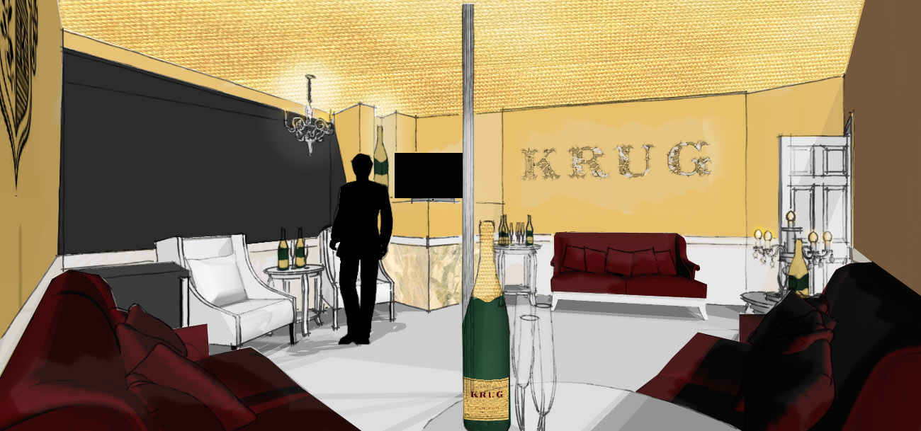
And finally, here it is, today's collage.


I'm content.  My concept of lightness and "heavenly" is coming across nicely.  I enjoy how the furniture is charismatic in its own way.  Of course, I ended up throwing in any lamp that resembles a "white chess piece" (as I have grown to call them) to add my graphic touch.  I am excited for this step.  It helps me move forward, and I think NEWH will appreciate the graphic thought that was put into this.

Time to focus on sustainability for awhile...

Thursday, January 26, 2012

Diane Bergeron

Wow. Diane Bergeron.


Prints!  Colors!  There is nothing better.

Sweet Springs: Concept Images & Sketches


This is it.  The one page I spent many hours Pinteresting (new verb!) yesterday in studio.  By the way--it seems I broke the search tool of Pinterest, seeing as last night it started malfunctioning, and this morning I awoke to a Pinterest tweet saying they were fixing the search.  This makes my life difficult... good thing I did my concept image board yesterday!

I'm envisioning a light, airy space that optimizes every opportunity for natural light.  The building only has windows on the north side.  The sun doesn't directly come into these windows regularly, so taking every opportunity to ligthen the space is essential.  Light finishes:  white-washed, reclaimed woods, white paints, pastels, with a lot of texture to contradict the white space.  Fun, refreshing, and relaxing, a bright oasis in the middle of the rolling West Virginia hills.

Speaking of these West Virginia hills... I started sketching and playing around with the idea of a waved ceiling, which actually turned out to look as though it was mimicking the hills/mountains surrounding the campus.


This is what I actually love about this project--I am familiar with the climate.  I know how the scenery looks, I've lived in it for almost six years now.  I'm aware of the feeling of being in the middle of nowhere and wanting something beautiful of which to be a part.  It's almost like Dirty Dancing, when they're in the middle of nowhere (actually filmed not too far from our Blacksburg campus, but supposed to take place in the Catskills, NY) and at a lovely resort.  Yes, I just referenced Dirty Dancing in a design blog.

Wednesday, January 25, 2012

Jaime Hayon: My Imaginary Best Design Friend

Quick thought.  Do Jaime Hayon and Marcel Wanders know each other?  Are they best friends in real life?  They might be design twins.  I think Marcel learned a thing or two from Jaime.

Who is Jaime Hayon, you ask?


Jaime Hayon (you probably pronounced that as "Jay-mee Hay-on", but it's actually "Ha-may Hay-on"... true story) is a Spanish designer who is absolutely my #1 influence.  Without a doubt, he puts a smile on my face with whatever he creates, and I think he's exquisite.  Can we also please note how extremely friendly and cute he is?  I saw him in a Dezeen screen one time at the opening of his furniture line (this is how I know it's Ha-May Hay-on:  I was just as baffled).  He's so passionate, excited, and knowledgeable about his product.  He doesn't care to follow with traditions.  His sketches turn to reality just as quickly as Winnie turns to stone at the end of Hocus Pocus.

Here is a very quick summary of Jaime's work, in image form, as words just cannot describe how unique his vision is as a designer.

Jaime invented the term "whimsical."
Camper store: my first introduction to Jaime.
The use of color in this project is so good it hurts.
Graphics. Graphics. Graphics.
I have to admit.  I used to be an avid Karim Rashid fan in my earlier days as a student in our design school.  He was outlandish, and crazy, and graphic.  His work caught my eye.  He was my idol.  Until I found Jaime Hayon while researching Camper stores for a project in fall 2010.  Jaime knows how to use color and graphics in every single thing he produces, which by the way, is just about everything.  Ceramics, furniture, sculpture, interiors, lighting, you name it.

I meant "everything."
Favn for Fritz Hansen.
When the Favn sofa premiered, I was fortunate enough to see it (and sit on it!) in a Scandinavian furniture showroom in Georgetown, DC.  The salesperson, while very knowledgeable about Scandinavian design in general, actually did not know Jaime Hayon's work.  I educated her, and told her she should most definitely check out his projects.  She accepted.  Just trying to spread the word!

Keep doing what you do, Jaime.  I want to be you.

Eight Bursts of Design

So, naturally, I've probably been searching through images for inspiration all day, and came across a lot of design food.  Design food.  I just made that up.  If it's not obvious enough--design food is imagery that I need in order to feed my imagination and get my wheels turning when introduced to a new project.

On top of the current project of Sweet Springs, WV for school, I'm designing eight new skyboxes in the Sapphire Club next to the existing Krug Champagne room that we just completed.  After I was pleased with my selections for Sweet Springs (seriously, a big Thank You to the creator of Pinterest), I started my design journey through different themes.  The search tool of Pinterest makes this excruciatingly easy (another huge Thank You).

VERY EXCITED!

While I am physically exhausted from staring at images on my laptop all day (it's a tough life), I'm still inspired and need to start sketching.  That's usually when most of the beginning magic happens--when I'm sitting with a blank page and a pen in my hand (Le Pen in dark grey, Swan in light grey, and black Pilot, preferably... gotta have those layers when you sketch!).

We have eight rooms.  Eight opportunities for me to let my imagination run wild.  This sounds like every designers dream, right?  Right.  Low budget, small space:  make it work.  I need to accept that I will most likely not be there to monitor the rooms when they are being built, so I have to design with a certain ease.  Nothing complicated.  Keep it simple.  Easy enough, right?  Right.

Keep it simple.

Let's do this.

Special shout out to Steve Moffett of PBJ Productions.

Tuesday, January 24, 2012

NEWH Concept Formulation

While I really am trying to write out a distinct concept for the NEWH Competition due at the end of February, it's a struggle.  I'm good with words, but conceptually speaking, it's rough.  I find I always want the same thing in my designs--white, light, wood, natural, brightness, clean, transparent, translucent, experience, journey, different perspectives, and colorful aspects.  I feel like this would fit perfectly into the competition criterion.  We are asked to design a restorative/regenerative hospitality project.  Lisa Tucker (my wonderful and intelligent, all-knowing professor) picked our site for our studio--Sweet Springs in West Virginia.

Old photograph of Main Building porticos.
Main building.
A "sister house", not part of the main building.
Porch of Sister House.
Sister House.

First of all, why have I never known this place existed?  It's thought to have been designed and built by Thomas Jefferson (seeing as UVA [ew] is not that far away), but there's also speculation that it could've been done by one of his main architects/sidekicks.  Either way, it's a gorgeous place, with traditional UVA-ish style.  Seeing as I am a Hokie, I should not be saying "UVA" and "gorgeous" in the same sentence, but I am.  My parents brought my sister and I up with the notion that UVA was the place we belong.  They are both from Vermont, and aimed to build a home with colonial influence.  At one point in my childhood, I remember our TV room (appropriately called the "parlor") being painted with light pink walls.  Green and beige couches.  Yeah, colonial.

After my sister went to Radford (a smaller university just 30 minutes from my beloved Virginia Tech campus) and I settled in as a Hokie, they abandoned all hope that they would one day be able to visit their daughter at the birthplace of TJ Architecture.  Sorry, parents.

It was not until my spring 2011 semester that I realized colonial color palettes actually fit my design aesthetic.  I was using my Frank Lloyd Wright restoration project as a competition entry for the Sherwin Williams Stir Competition and had to use their colors specifically.  I noticed a "colonial revival" section of their color library and was stunned that they actually went together with my project.  Most people would think pastels are the main palette for colonial revival, but I've always been a big fan of greys and beiges, especially together, with pops of color.

My house in my hometown is the only one on the block without shutters.  My parents took them off.  It wasn't colonial with the shutters still attached.  After all, they weren't functional shutters, merely for decoration.  Understandable.  HOWEVER, there is one house up the street from us that to me, is true colonial wannabe.  The people that moved into this house knew what they were doing.  Grey wood-paneled house (not vinyl siding. never vinyl siding; or so my mother tells me... always) with a red, almost coral-tinted door.  It reminds me of the times my mom and I pass through Deerfield, MA and check out the actual original houses from that era.

I also recall visiting a property not far from Mount Vernon in northern Virginia, which is also next to a FLW building (Pope Leighey House).  At the moment I can't recall the name of this property, but I absolutely do remember the main living/dining room and the excellent shade of blue/teal/green the walls were painted.  This is when I came to believe I was in love with colonial decorating.

*Gasp* decorating?  I almost can't believe I just said "love" and "decorating" in the same sentence.  But we need to come to grips with reality.  As designers, we love to decorate.  It's most likely what we started doing as children and how we got into the design field itself.  I know through my entire years of having my own room at home and school, I loved to decorate.  I love pretty things.  I love well-designed things--especially antique things.  My parents are huge antique shoppers as well; go figure.

Why am I rambling?

This is what I do to formulate concepts.  I ramble.  Yesterday in class, I sat with my sketchbook on my desk and just wrote down whatever came to mind.  Here's what came out:

  • Revival of Sweet Springs as a place of aristocracy & elegance
  • strength & fortitude through rehabilitation
  • restoring the interior to a natural lightness / cleanliness that encourages well-being and relaxation
  • heavenly / clouds / rolling hills
  • home away from home: escape from reality
  • NO WIFI
  • reclaimed materials
  • in country hills of WV away from everything and everyone
If I did not make myself clear in the beginning...  We are to design a restorative/regenerative place, that both restores the campus of Sweet Springs and also the people that come to it.

Sunday, January 22, 2012

Society6

As a proud owner of the iPhone 4 (white, of course) since May 2011, and a strong believer in the things that Steve Jobs accomplished in his lifetime, I felt it sacrilegious to cover such great design with any sort of plastic cover.  I could never find one that I was satisfied with, and quickly gave up on any venture to buy a protective case for my beautiful, adorable, precious white iPhone.  My friends all have intense incase's that make the phone itself completely unrecognizable.  In fact, people would see my phone and ask what it was.  They're so used to seeing a huge massive piece of unattractive plastic surrounding their iPhone.

Cases weren't the only issues with me.  I figured I'd need at least SOME sort of protective in case I dare *gasp* drop my iPhone (the thought alone makes me cringe and want to cry).  The screen protector seemed like the only option suitable for my peculiar needs.  After all, if I dropped it, at least the screen wouldn't crack (or so I hoped).  After applying it to my screen I very quickly realized that it entirely changes the appearance of the crisp, perfect screen display of the iPhone.  It mattes down the glare and keeps the screen smudge-free, but adds a weird effect to the screen display itself.  I had it on for a couple months then peeled it off out of frustration after having a few drinks one night.  Smart move.

What I'm really here to say is...  All of the cases I've found cannot even begin to match up to the extraordinary design of the iPhone.  This, along with the fact that I am entirely indecisive when it comes to something I have to see everyday, is the reason I've been flying solo since May.  People call me crazy, insane, and ballsy, but I stand true.

All of these feelings changed when I was searching Pinterest one day and found Society6.com.  Where has this been all my life?  It's basically Threadless for iPhone cases.  Artists have prints that are easily converted into iPhone cases and skins, even T-shirts.  Brilliant.  Real designs and illustrations from real artists that are intriguing and not anywhere near generic.  The best part -- $35.

Here are some of my current favorites (it will take at least a month for me to choose one).


Friday, January 20, 2012

Krug Champagne Room - Las Vegas!

Since November 2011, I've had the privilege of helping with the design of a Krug Champagne Room (the club calls it a "skybox") along with Velvet Crossing Marketing out of Las Vegas. Exciting, yes?

A friend in studio recommended me to Velvet Crossing when their client, Krug, told them they wanted "watercolor-y" and sketchy renderings for this upcoming champagne room.  Naturally, this is what I'm known for in our program, and I agreed to help them. After all, it's Vegas, and it's what I do best--why would I decline?

The mood board and overall feel of the room was to be regal and classy, representing the Krug brand.

I worked with Steve, a recent graduate of Virginia Tech, to bring his mood board vision to life through the design of the interior. We worked countless hours together via phone and finally ended with a product we both were extremely proud of.


Taking inspiration from the Krug label and crest/shield, we developed the space...


Special features include custom maroon sofas and white chairs, a mini chandelier, and gold leaf ceiling to imitate the top of a Krug bottle. A mirror mosaic with the Krug logo is on display on the wall by the entry. Regal gold walls with white trim bring a certain softness. All furniture is the same height and runs up to the height of the chair rail to control uniformity around the room.

I never thought this design would actually be built... I'm merely a student designer in southwest Virginia, how could I be designing a champagne room in Vegas?

My dream became a reality. Velvet Crossing flew me out (first class!) to work in the office and aid with the construction of the room itself, while working on another potential project in the works. Vegas is an interesting place with a variety of people, places, and things to see. I enjoyed my time there, in a sort of fantasy land.

Final photos of the room...


Final for TheLab - 5 weeks later!

I'm late at posting the finals for the corporate office we designed for TheLab NYC... The project ended with a long, long, LONG all-nighter in studio with two of my colleagues. Yes, procrastination at its finest. Unfortunately, I work a lot more efficiently under pressure to finish--but, I find myself cutting corners in the end to make up for lost time.

I'm very pleased with my final renderings and concept. The idea of having cozy dwellings in the middle of the office to imitate a small city came out well. Seeing as I am not in any way, shape, or form, a fan of space planning, I am surprisingly also proud of my floor plan. It's intriguing while being well-organized and efficient. There are some things that could have been changed and fixed toward the end, but time got the best of me and I had to settle.

Graphics are the most important thing to me when I have a project and need to pull the ends together for a final book. Extra diagrams and sketches aided my presentation style.

Reception with Marketing Area
     

Conference Room adjacent to Reception

Resource Library near Senior Offices

Inner Private Office "Neighborhood"


Design Team Workstations near windows
Artwork is by Paul Klee; it was chosen to add even more personality to the interior along with the selection of fabrics chosen for the Kimball furniture. I was surprised with the range of fabric choices available for Kimball's furniture, seeing as the collections themselves are not all that interesting. I was elated to find fun, funky fabrics to use in the seating areas. The fabrics, I feel, really go well with the "hipster" vibe of the office and area in Yaletown.

Around the windows of the design team workstations are also plaster mouldings (arches) around the existing frames of the building, on top of the old brick. This also adds a unique touch while still holding true to the original architecture of the building and time period.

All-in-all, I'm proud of this project and enjoy explaining it to others.